When going to make a new Alaska Miles Award Chart, I ran into a problem unique to Alaska Miles – Alaska’s Award Chart is different for each one of their partners.
A flight to Asia is a totally different price on American than it is on Cathay. Also note that Alaska isn’t part of an alliance and may have fewer partner options than most.
I also noticed how many routes are cheapest on Condor air. But Condor has fewer flights than major airlines like British Airways, Cathay, or American, so the number of destinations is limited.
Thus, the best way I can think of to display the prices are via maps, just like I did recently with Flying Blue’s Award Maps.
When you highlight a country, it only shows you the cheapest Condor price if Condor has flights to that country and it will only show the AA off-peak award price if AA flies there.
Unfortunately, the map doesn’t yet show you which airline is the cheapest. Instead, simply check out their award chart page to find the details on which airline is cheapest for which region.
First are the maps, second is the award chart.
Alaska Airlines Miles Award Maps
All prices are oneway awards.
Economy Map
Business Map
First Map
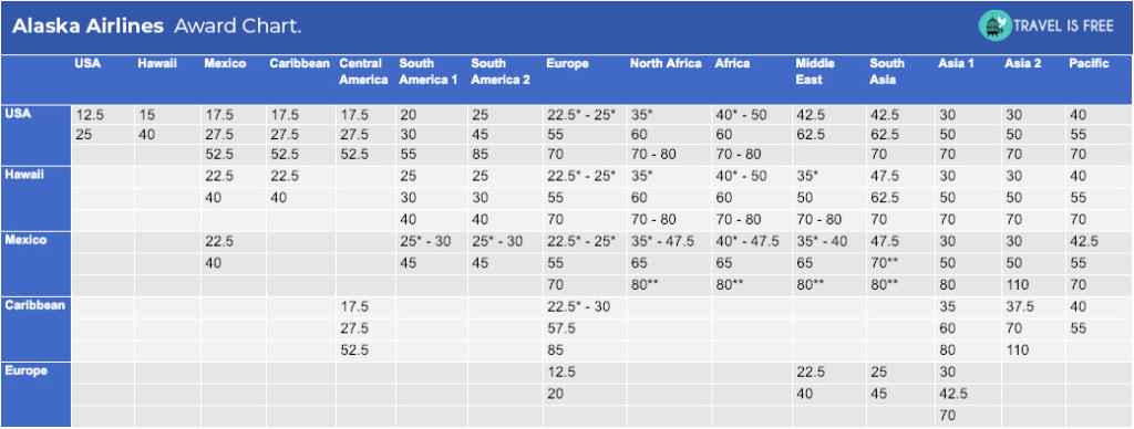
Alaska Airlines Miles Award Chart
Just like the maps, this doesn’t clarify which airline is showing this cheapest price – although I try to indicate off-peaks with an asterisk(*).
It may be simplistic leaving off the airlines, but it reduces dozens of pages and charts to one chart.
All prices are oneway awards.
One thing to note about the award chart – there are a lot of region to region options missing, and in my experience, that means that these other routes are not bookable.


![The [Only] United MileagePlus Award Chart](https://travelisfree.com/wp-content/uploads/2019/04/United-MileagePlus-United-Airlines-Award-Chart-120x86.jpg)


Nice! I love Alaska awards, so thank you!
2 questions: is the first map supposed to be about economy seating? (I think you linked to biz class pricing). And this is one way?
Thanks!
Yep, oneways.
I think the first chart is right. Is it showing 22.5k for a lot of western Europe for you? If not there’s some kind of display issue.
Drew,
I’m normally a big fan of your content, but this post really isn’t that helpful considering the complexity of Alaska’s award chart. With one click, this page https://www.alaskaair.com/content/mileage-plan/use-miles/award-charts is far more informative
Well, it’s showing different information. The maps above are taking into account each destination of each partner, which the Alaska link does not (plus, it’s just a visual display).
For example:
– You can instantly see that a first class flight to South Africa is 1/3 the price of its neighbor, Zimbabwe. That’s taking into account that Cathay is the cheapest partner, and they fly to South Africa.
– Same with India vs the Middle East.
– Or AA off-peak destinations.
– Or Condor destinations – for example Egypt is 35k, instead of its neighbors, which are 47.5k
To me, that is interesting information, and I’m proud to do a unique visual display of information. There are plenty of places to read about credit cards if one prefers, but I’d rather create this.
Nonetheless, hopefully, other posts, are seen as more useful to more people.
Tableau! You can build a sheet that shows a listing of all the airlines and costs going to a country and put it in the tooltip.
Honestly, that’s exactly what I’ve been looking for, EXCEPT, I don’t think Tableau is made for me publishing online… It’s more for sharing with my time. That’s my understanding. Plus, it’s $70 a month.
But I’ve been looking for a better map program, but I come back to Google because it’s free, easy, looks fine (except way less detailed, as you’ve pointed out), and does what I need.
But if there is another map program that’s built for data visualization, and does what I need (for cheap/free), I’m eager to switch. I need to really. But just haven’t found anything.
Try arcgis.com they have a free version. I have used it to map and share my travels.
Drew,
Really nice! Now I can quickly compare with other Alliances if I am getting a better deal or not..
Yeah, exactly. That’s why I did the condensed award chart – because I can quickly glance at almost another program and with Alaska you have to sift through pages and multiple charts on each page. But obviously, the Alaska page is still useful for showing airlines. Hopefully, I can figure out a way to show both.
Nice work 🙂
Do you know if anyone published a chart/tool that shows Fuel Surcharges relative to award bookings?
Thanks so much! This is super useful! I love your resources.
How do you get to Morocco in first class for 80,000 miles? I only see emirates at 180,000 miles when I search flights.