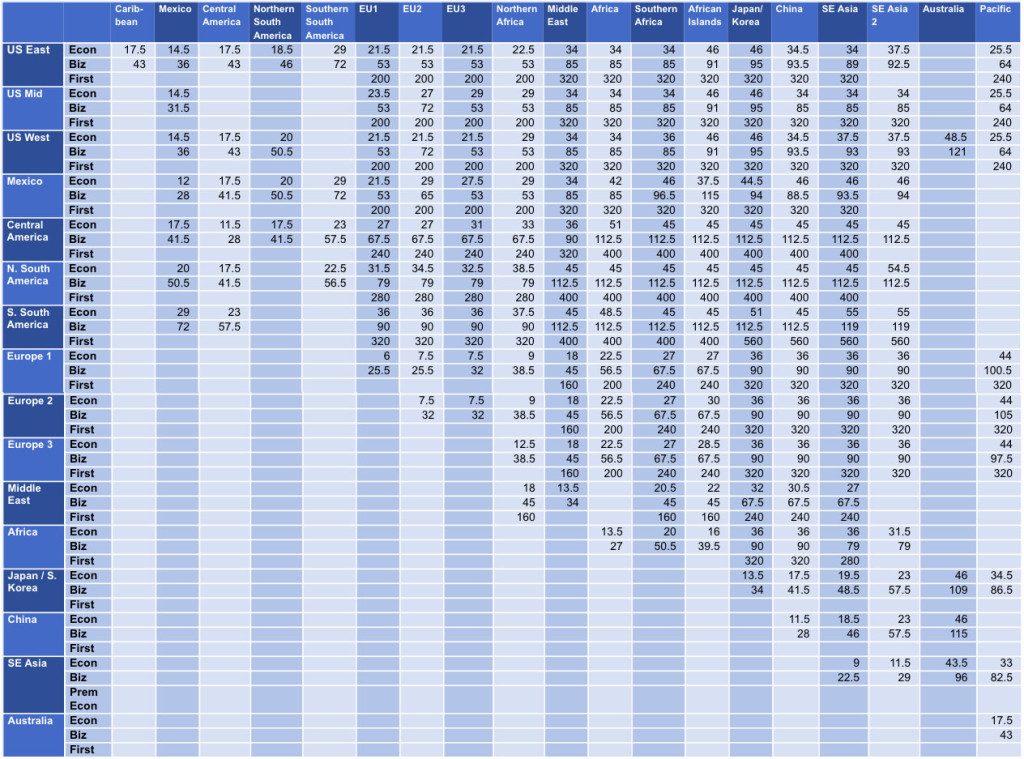
AirFrance’s Flying Blue Miles removed their award chart, so I decided to make one of my own.
The problem is that prices vary from one city to the next, and the possible “region” grouping is too big to show all prices accurately in a chart.
However…
1) This mostly effects the US. So most regions are smaller and relatively accurate.
And 2) I made a Flying Blue USA Award Map recently, and those better display prices to/from the USA. It doesn’t help with accuracy, but it’s the best visual display of Flying Blue Miles pricing on the internet.
In this post:
- See the only Flying Blue Award Chart
- I’ll repost the Flying Blue Award Map (to/from USA)
- And I’ll further explain things like region definitions, and the problem I’m facing.
THE Flying Blue Award Chart
Maps
Award Prices from USA East
JFK Economy:
JFK Business:
Award Prices from USA Mid:
DFW Economy:
DFW Business:
Award Prices from USA West:
LAX Economy:
LAX Business:
Explaining Further
The Problem
The challenge, and the reason they don’t have a public award chart, is that the prices vary city to city. They’re fixed prices from specific city pairs, but like all programs, it doesn’t mean that the flights are available at the lowest advertised price.
Therefore, flights to one region might consistently be the same and similar for most searches I did, and then be totally different for another city pair.
As an example, most searches showed that African islands like Seychelles, Mauritius, and Madagascar all price the same… Just consistently the same. But then on a search from a 10th and different city, I might get very different prices.
So I grouped things as concisely as I could, but you’ll still notice a lot of variation.
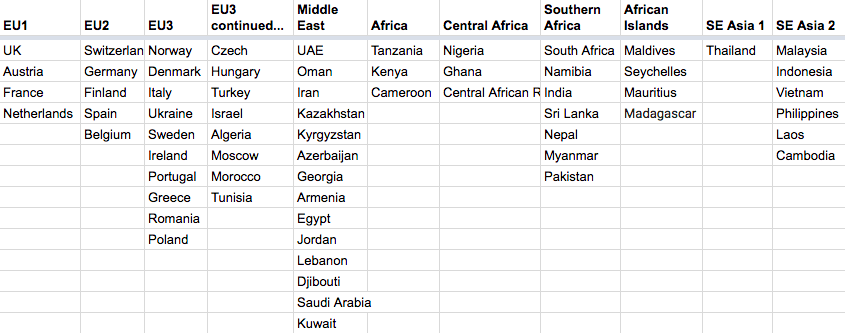
Region Definitions
This is not conclusive, and again, it’s the best grouping I could come up with, but there are still a lot of variations.
Therefore this is the worst, over simplified grouping of countries, for an award chart’s “region definitions”… But it’s the best I’ve got for now.
I left out the Americas for now, because it’s more self explanatory. Everything else is confusing, to say the least.
Also, note that India is in “Southern Africa”. It’s just simplified the groupings. The only real difference between the Central Asia area and Africa, in terms of prices elsewhere, is to east Asia – like Japan. India is a lot cheaper. But from the US or Europe, it’s usually the same.
Conclusion
This is not a perfect award chart, but it’s the only award chart. Otherwise you just have to search using Flying Blue’s award search or incomplete calculator.
This is NOT my new “best use” post on Flying Blue Miles, but it does give some insights. There are some really bad redemptions, and some great redemptions.
Most of the relevant (for an American) great redemptions are apparent using the maps… However, I think others will find useful awards. Anytime so many countries are lumped together, you get some sweet spots. For example the close link between Europe and the Middle East and Northern Africa. I know flying from Europe to Egypt, there just weren’t a lot of great redemption opportunities, but Flying Blue has reasonable prices.
Again, this doesn’t begin to cover “best uses”, as fuel surcharges are also relevant. But that is for another day!


![Nick of FM on #40kFarAway [TIF Podcast]](https://travelisfree.com/wp-content/uploads/2019/10/travel-is-free-podcast-nick-40K-120x86.jpg)


DFW to Turkey/Morocco looks really good
I wasn’t able to find a europe city-cairo flight at the listed 9K (in the chart). They all came up as 18K. Which city pair gave you this value ?
Cairo (Egypt) is in AF Middle-East Region.. although in Africa… so it’s 18k
Thank you, thank you, thank you!
US-Europe is a mixed bag. I find that DL/AM flights on the transatlantic leg will price out at 72k in J, while AF/KL on the transatlantic will either be 53k or 61k (I checked mainly LAX/SFO to TLV/IST only).
Hi, thanks for the content, one question pal, how could I see this Award Maps from / to different destinations? I am mostly interested from South East Asia to Eastern Europe, and for the other frequent flyer programs as well.. thanks…